

Book cover design - Illustration
This project was completed for the Refine Technique: Illustration course at TAFE, where we were tasked with collaborating with a publishing house and its authors to develop a double cover design.
For this assignment, I worked with Night Parrot Press on The Double Novelette, designing a cohesive two-part cover. I focused on research, concept development, and iterative refinement to create a design that reflected the narrative, connected both stories, and aligned with the authors’ vision and editorial guidelines.
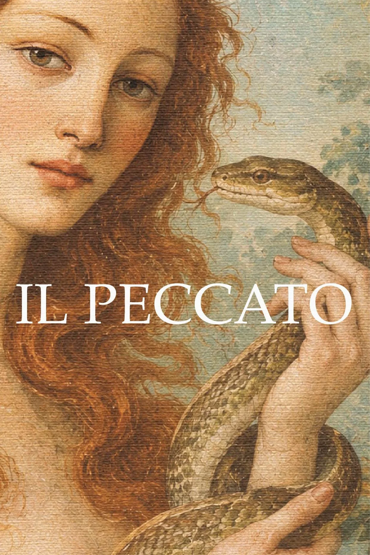
wine Label Design - Illustration/ Branding
This is a fictional wine label design project inspired by the story of the forbidden fruit in the Garden of Eden.
The concept explores the relationship between desire, temptation, and sin through two complementary labels, each portraying a different perspective of the story.

Poster design - Illustration
This project stems from a personal childhood memory from the early 2000s. Through this poster, I transform that intense, chaotic and deeply joyful experience into a scene that captures the energy and adrenaline of those moments.
The proposal explores the intersection between memory and retro visual culture, reconstructing a domestic scene shaped by play. Throughout the process, I worked through emotional evocation, graphic synthesis and the construction of an atmosphere that engages with the aesthetics of classic video games, aiming to balance humour, nostalgia and visual storytelling within a single image.

Lettering - Custom Lettering
My lettering work is born from gesture and intuition, transforming words into visual pieces with character and personality.
I conceive hand-drawn typography as a graphic element in its own right, creating compositions with intention, rhythm, and visual presence, designed to adapt across different formats and surfaces.

Pepperoni Club - Brand & identity
Pepperoni Club is a graphic tribute to the culture of sharing pizza. Its visual identity draws from traditional pizzeria signage, using a bold, handcrafted-style typeface that conveys warmth, authenticity and community. Simple, expressive line illustrations bring personality and spontaneity while keeping a contemporary feel.
The colour palette, inspired by pizza ingredients, combines vibrant reds and deep greens to create strong contrast and a clear connection to the product. At its core, Pepperoni Club celebrates the joy of sharing pizza and a cold beer with friends, capturing both the first bite and the pleasure of gathering around good food.