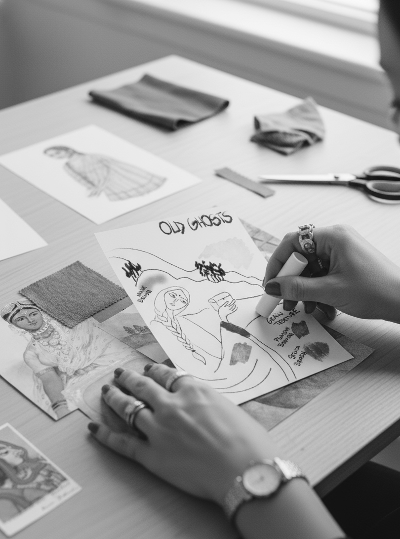
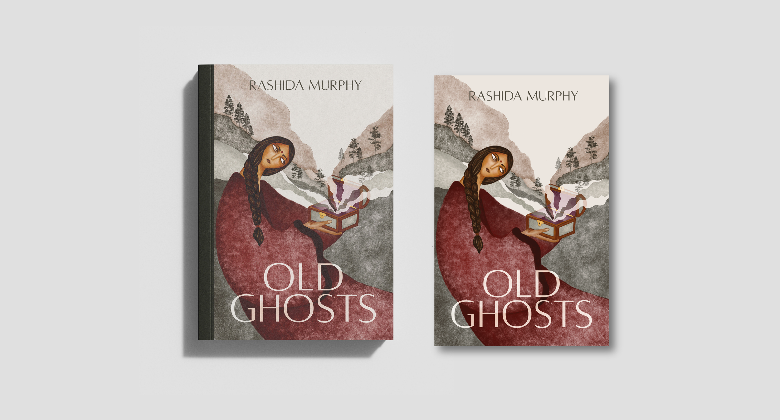
Old Ghosts - Written by Rashida Murphy
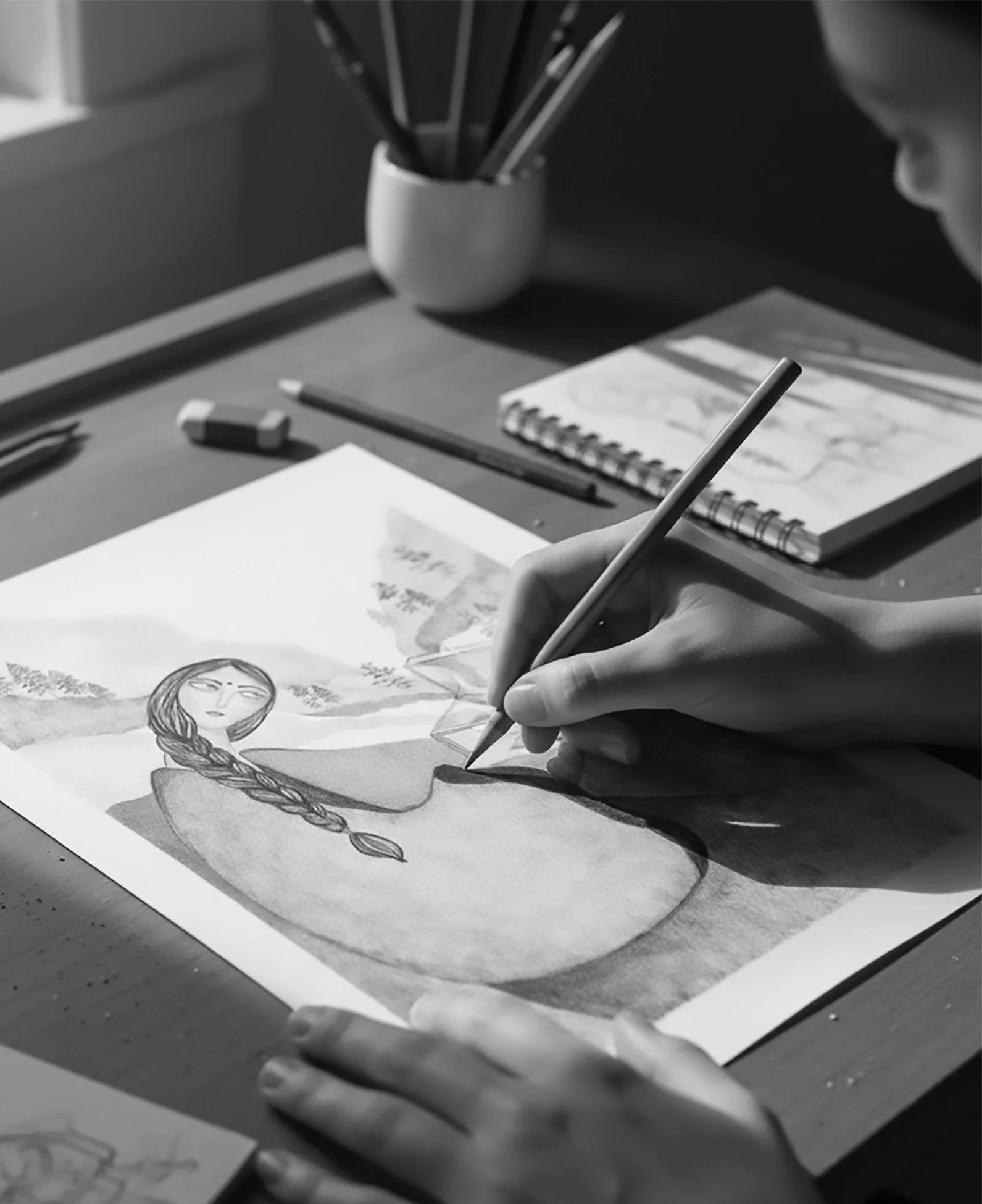
Book cover design process
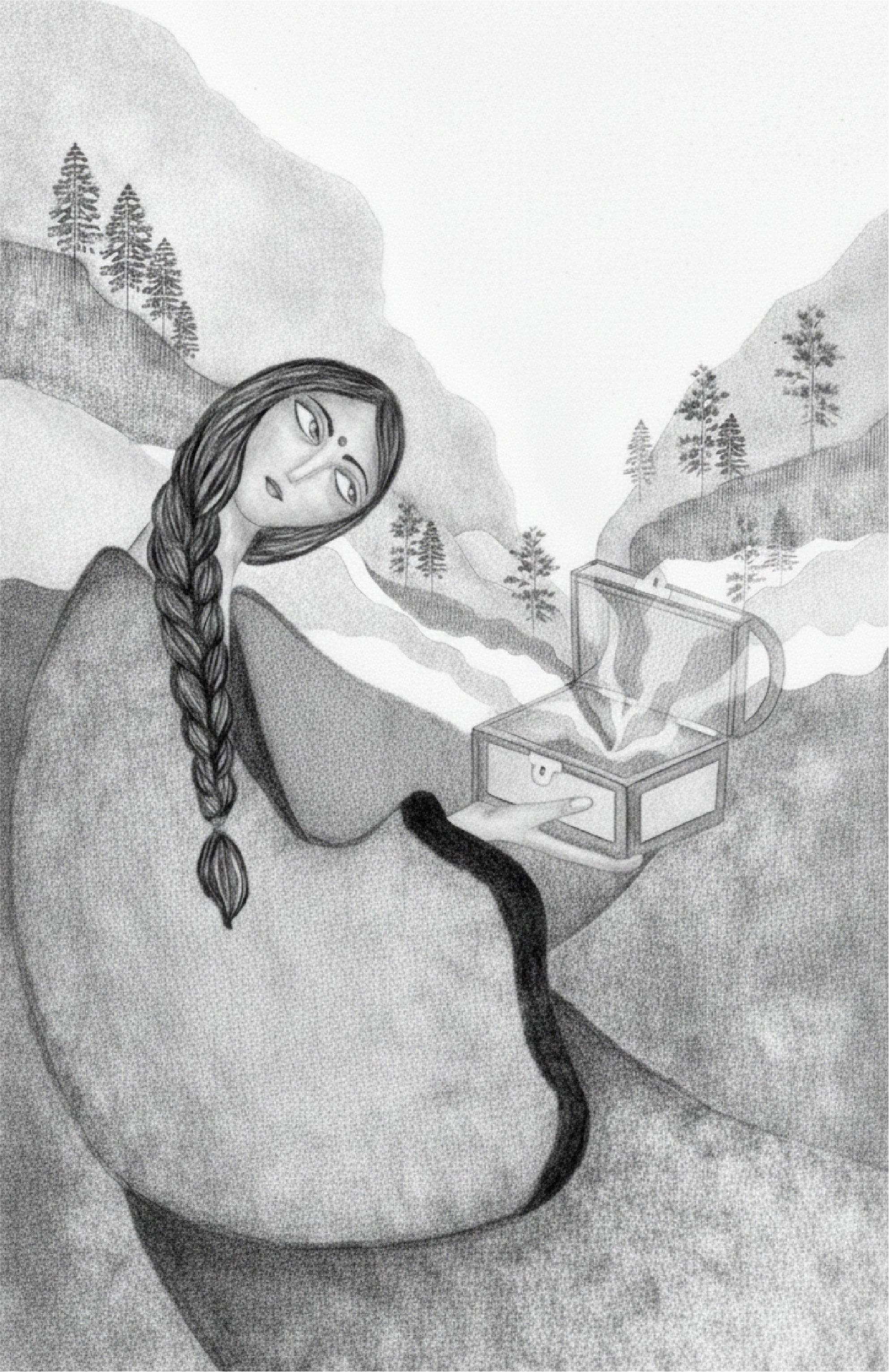
Old Ghosts by Rashida Murphy is set during the final years of British colonial rule in India. The novel follows Princess Chandni and her family after their failed escape from their kingdom. The Maharaja is killed and the Queen and Chandni are captured by a bandit, remaining in captivity for decades. As India moves toward independence, the memory of the missing royals slowly fades from collective consciousness. The story explores identity, loss, violence, resilience and historical memory.
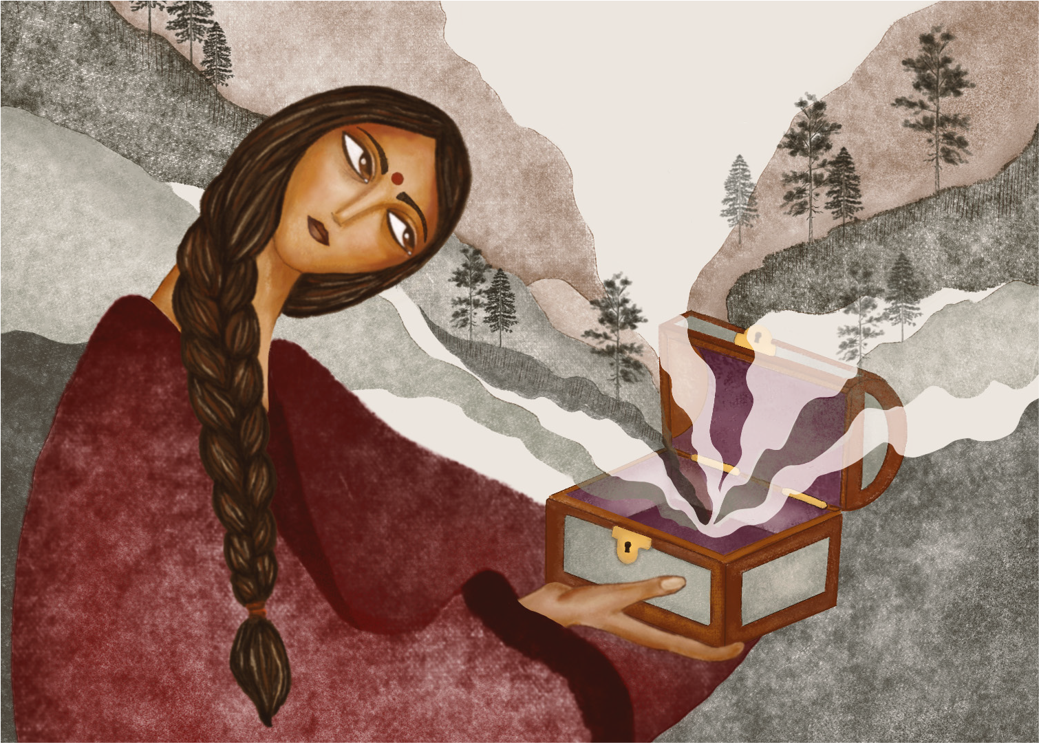
My visual approach focused on expressing Chandni’s inner world. I illustrated her holding an antique box from which a landscape emerges. This symbolic element suggests how her past, the lost kingdom, captivity and trauma, continuously unfolds around her, becoming an inescapable emotional environment. Chandni’s gaze became central to the composition. I aimed to convey restrained sorrow and emotional weight without overt dramatization. Her expression reflects both vulnerability and quiet strength.
To reinforce the atmosphere of the narrative, I chose a palette of desaturated earthy tones, evoking time, erosion and memory. A subtle worn texture enhances the sense of fragility and lingering scars.
The final cover preserves the initial conceptual symbol while refining composition and visual hierarchy to achieve clarity and narrative focus.

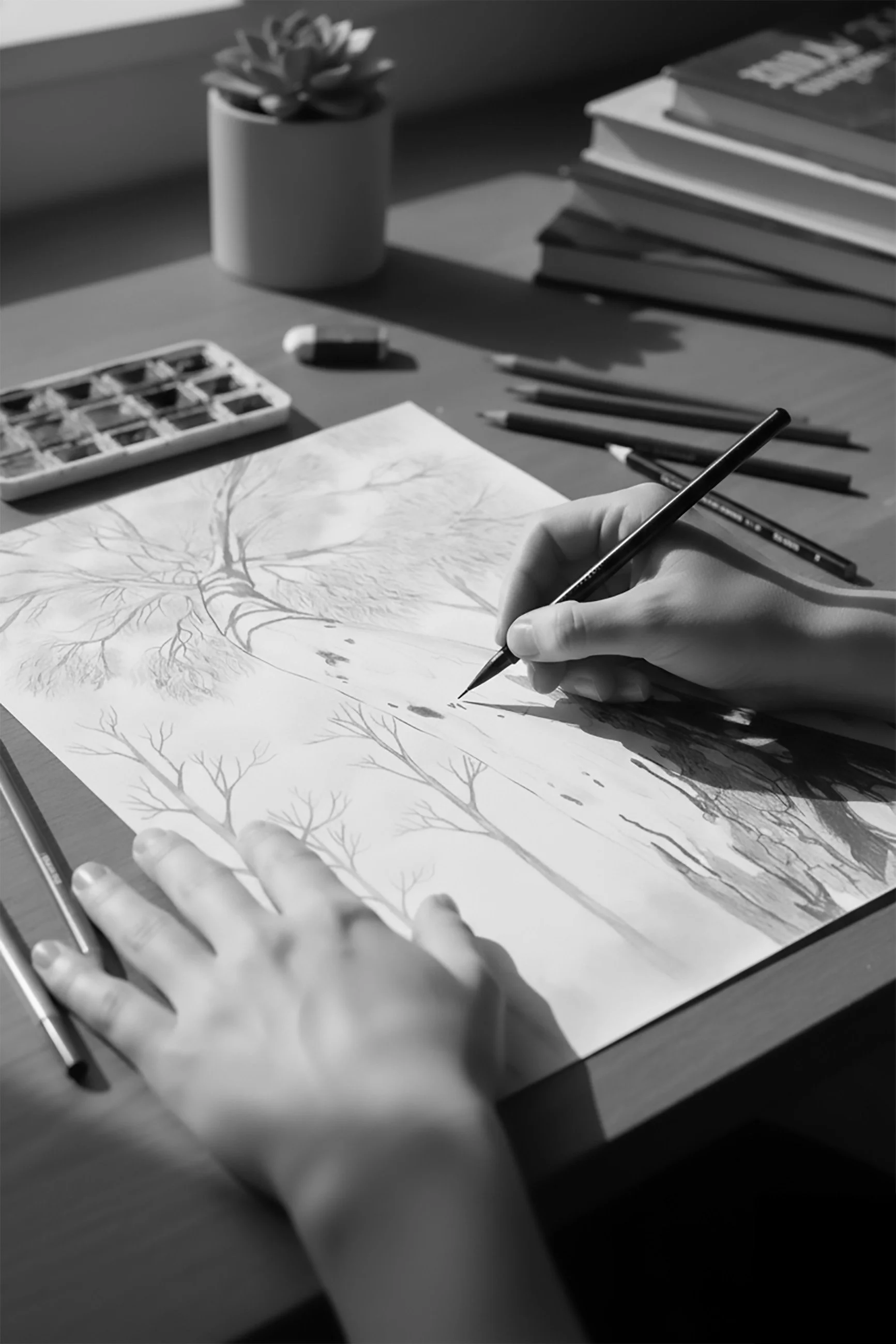
Early concept sketch
In this initial stage, I focused on developing the visual identity of the main character. The publisher specified that the author did not want a stereotypical fairy tale princess, but rather a more complex and realistic representation. It was also important to incorporate the landscape between Pakistan and India as part of the cover’s visual identity.
The challenge was to balance these expectations while portraying a princess shaped by injustice and oppression.
The colour palette became a key decision, supporting the emotional tone and reinforcing the atmosphere and narrative.
Refined sketch
After several explorations based on the initial sketches, I concluded that the princess needed a stronger presence within the composition. To achieve this, I adjusted the visual hierarchy by increasing her scale in relation to the other elements, allowing her figure to become dominant and emotionally impactful.
I also simplified the design of her sari to avoid visual distractions and strengthen the clarify of her silhouette. At the same time, I reworked the background to create the impression that the landscape was emerging from the box, integrating both elements more organically and reinforcing the central visual metaphor.
Whatever it is, the way you tell your story can make all the difference
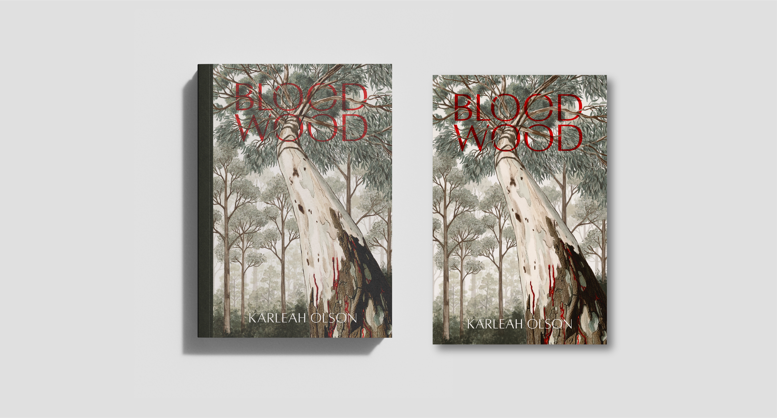
Bloodwood- Written by Karleah Olson
Book cover design process
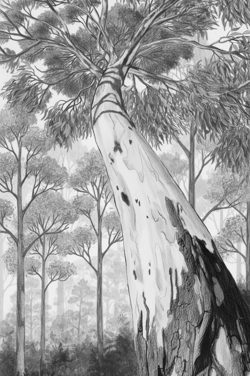
Bloodwood is a multi layered narrative set in the karri forests of southwestern Australia. The novel interweaves three storylines that gradually reveal their connection: a young girl found alone in the forest, a woman seeking refuge in isolation after a traumatic experience, and a young man who returns to confront his family’s past. The work explores loss, violence, inherited memory and the deep relationship between landscape and identity. The forest does not function merely as a setting, but as an active presence that shapes the characters’ destinies.
For the cover, I illustrated a eucalyptus tree positioned in the centre of a dense forest, stretching upward toward the light. The tree struggles to break through the surrounding foliage, becoming a visual metaphor for the female protagonist and her resistance against male oppression, as well as her attempt to reclaim autonomy after violence.
The strength and resilience of the tree symbolise perseverance and the possibility of healing that run throughout the narrative. Just as its roots remain grounded while the trunk rises, the character carries her trauma yet continues to seek light and transformation.
In terms of colour, I chose a palette of desaturated earthy tones, maintaining visual coherence with Old Ghosts. This decision creates an aesthetic dialogue between both covers and reinforces the emotional connection between the stories. The final composition balances symbolism and atmosphere, allowing the landscape to function not only as a background, but as a central narrative and emotional force.
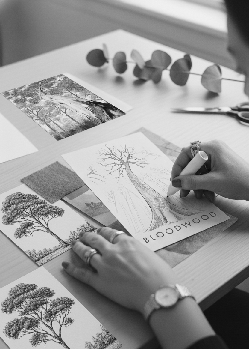

Early concept sketch
For the cover of Bloodwood, the publisher informed us that the author did not want human figures, but she was interested in conveying aspects of Australian flora, particularly the Karry forest. As with Old Ghosts, the story deals of themes with violence and abuse, so the challenge was once again to reflect this emotional weight through and illustration that aligned with the author's vision.
To approach this challenge, I began with three different concepts for the initial sketches, exploring various ways to represent strength, resilience and the oppressive atmosphere of the narrative through the landscape and vegetation.
Refined sketch
After several explorations based on the initial sketches, I concluded that the princess needed a stronger presence within the composition. To achieve this, I adjusted the visual hierarchy by increasing her scale in relation to the other elements, allowing her figure to become dominant and emotionally impactful.
I also simplified the design of her sari to avoid visual distractions and strengthen the clarify of her silhouette. At the same time, I reworked the background to create the impression that the landscape was emerging from the box, integrating both elements more organically and reinforcing the central visual metaphor.